
What began as the promotional name of a single event evolved into a monthly series in 2001, featuring bluegrass and old-time bands at the Hotel Utah in the SOMA neighborhood of San Francisco.
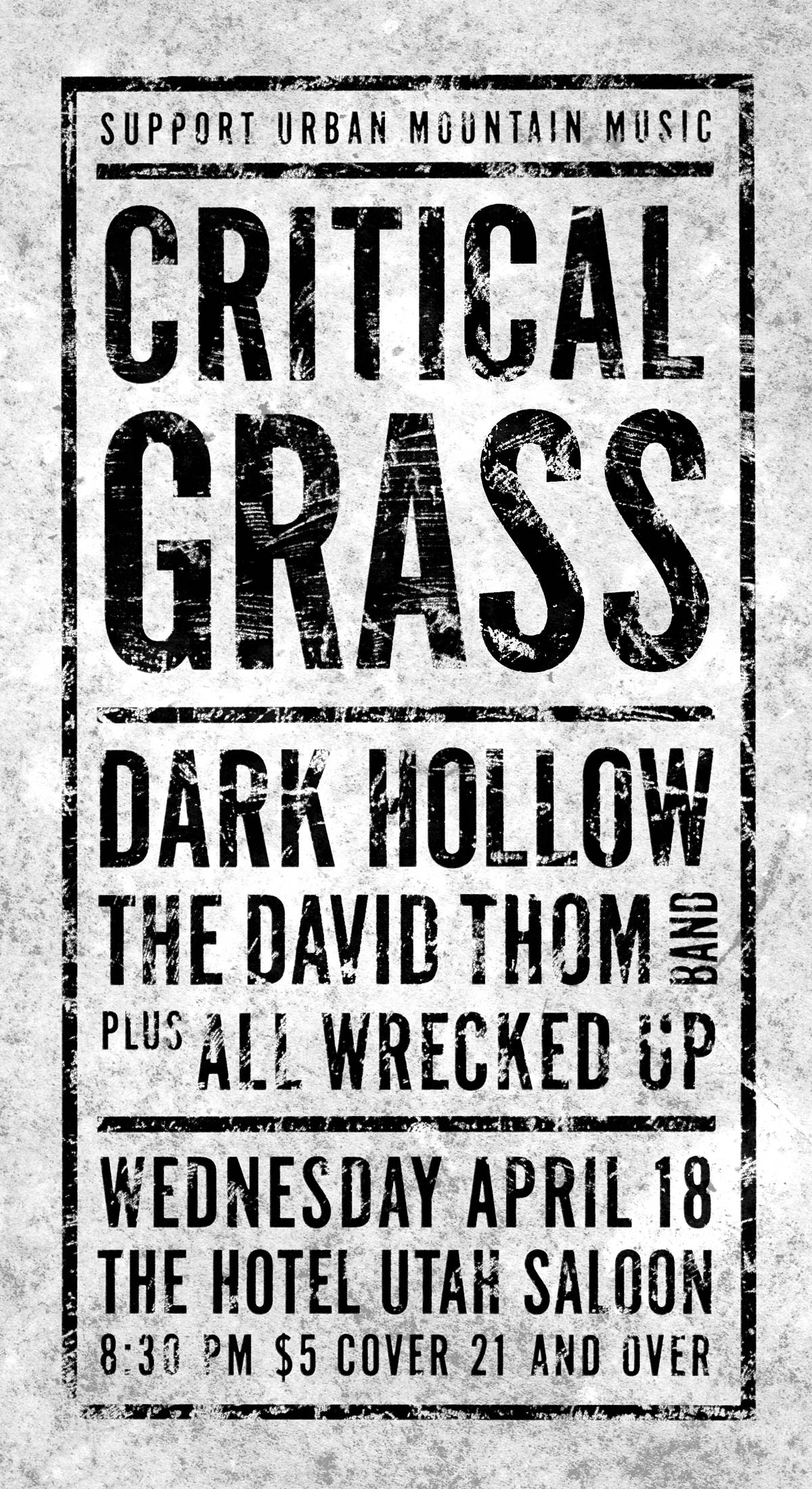
This was the era of photocopied band flyers. For the design I pushed the capabilities of my laser printer (and of the self-serve machines at my local Kinko’s Copies), with a heavily-distressed texture applied across the entire mini-poster. I trimmed each flyer by hand so that the texture could reach edge to edge.
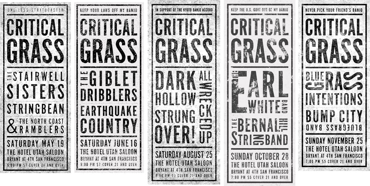
I retain some fondness for the typeface, an ultra-condensed gothic called “OPTI Alternate One”. OptiFonts was a brand of discount (and dubiously sourced) fonts that I’d (cough) acquired on an agency job some time in the 1990s. Today it can be found online for free, because the original publisher likely stole it in the first place.